Here are the main stages of a typical watercolor portrait of mine. I posted a shortened version of this on my FB, tumblr and Instagram but thought I would elaborate more here.
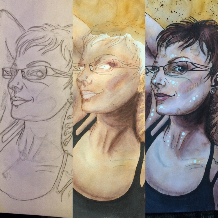
Stage 1
The first stage is using a reference photo (sometimes I use multiple photos and combine them, like I did with my friends Ijeoma and Andrew) to create a pencil sketch. This is generally the most time consuming part and creates the skeleton for the entire image. In this example, the shadows are bumped up in post processing to make the sketch appear darker than it is, but I do seem to rely on these lines more than most of the process photos and tutorials I see on youtube. But comparison is an art killer, so fuck it.
This part is generally the brow scrunching and sort of annoying part. Every time I erase, I damage the watercolor paper some, and I already work pretty wet most of the time, often causing nubbins to develop on parts of the paper that I pick off with tweezers. This is where I really appreciate having an art projector, though there is definitely a deepened sense of satisfaction when drawing these freehand.
For this portrait, I used my pigma micron ink pens to outline the pencil sketch, then erased the pencil (which often shows through the watercolor in ways I don’t like), but sometimes I save the outlines for later. Just depends.
Stage 2
You can see in this image that the lines aren’t nearly so harsh, in part because I have erased the pencil. I am working on sketching with less pencil shading since I just erase it anyways, but for right now it helps me see the balance of the shapes as I draw and gives me a chance to practice where I want shading. At the point that I took the middle image, I had probably let the paper dry two or three times. There is a lot of drying, then wetting to smooth color edges in the way that I work, and lots of building up of the dark layers. The white balance of the photo is a bit warm, here.
Stage 3
At this point, I have added all the watercolor I intend to add and started working on highlights and deepening shadows, which I do with white and black ink pens respectively. My style is lines for dark and bubbles for highlight, usually but not always. I like to add a few squiggles and dots here and there for depth and detail, and at this point I usually widen my outlines with a slightly larger micron. Eventually, I would really like to upgrade to acrylic inks and nibs for this. The white balance of this third image is a bit on the cool side, but I like that it shows the element of detail in how I add texture to skin by utilizing both cool and warm tones.
So yeah, that’s how I do it. Usually takes a few hours. Eventually I hope to be the type who can draw interesting backgrounds and not get totally burnt out, but for now it’s color splotches, swirls, and drips.